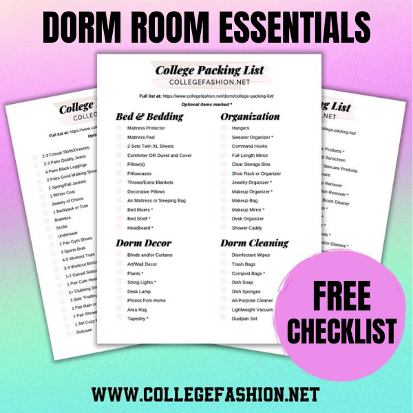
The Ultimate College Packing List for Girls
This list has everything — and we mean EVERYTHING — you need to bring to college.
This list has everything — and we mean EVERYTHING — you need to bring to college.
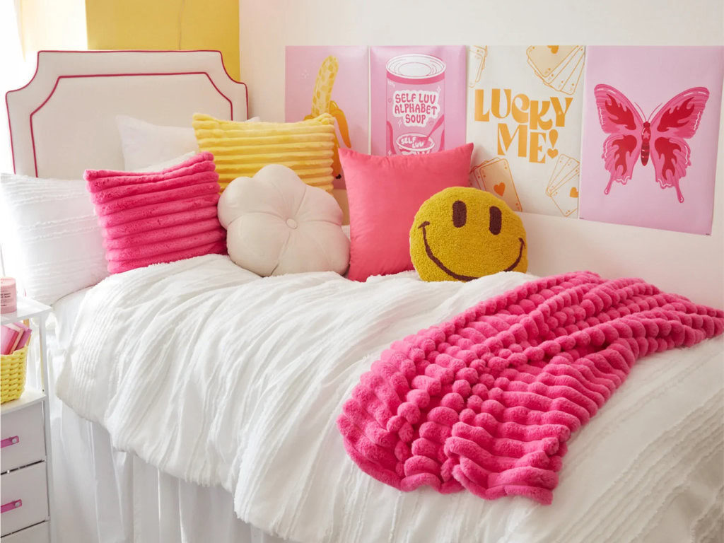
Transform your dorm room into the cutest, coziest space with these affordable decor picks.
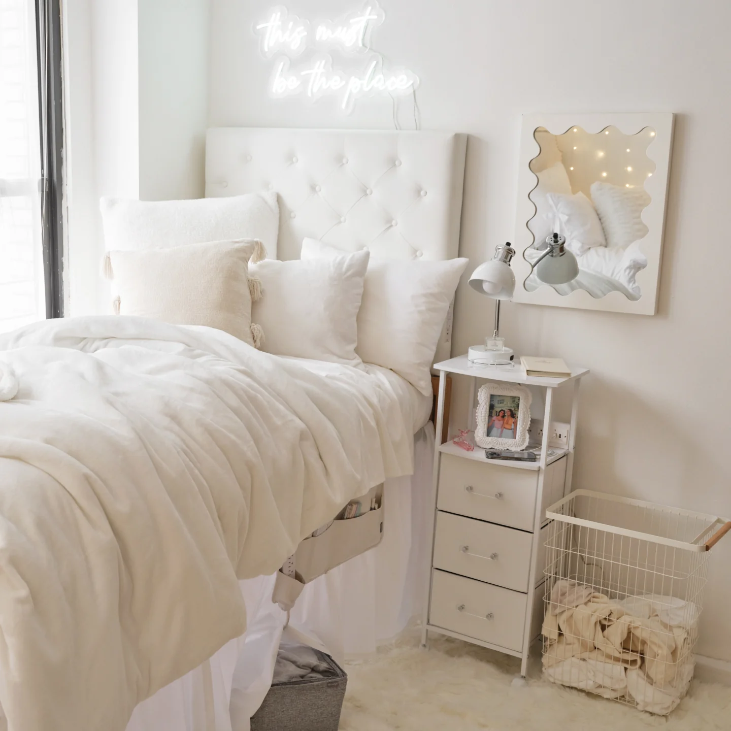
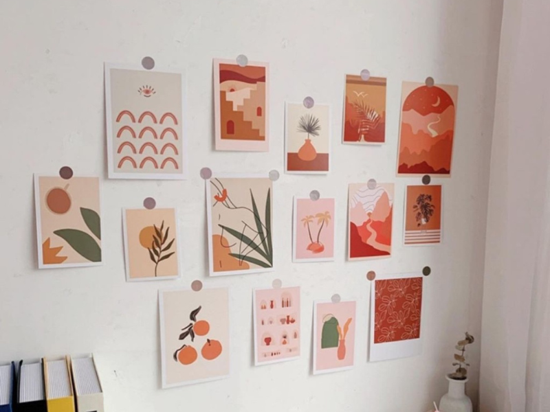
Create your dream bedroom with these vanilla girl decor ideas.
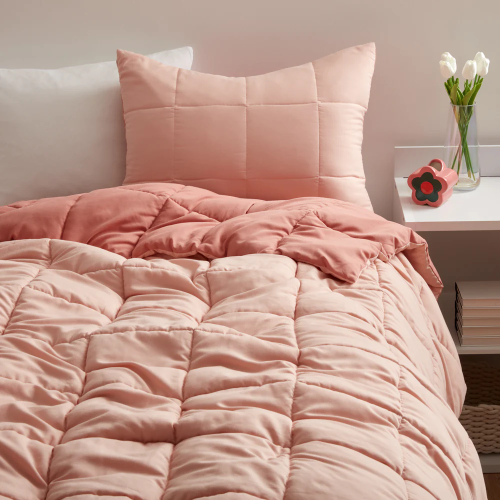
Make your bedroom comfy and cozy with these decor ideas!
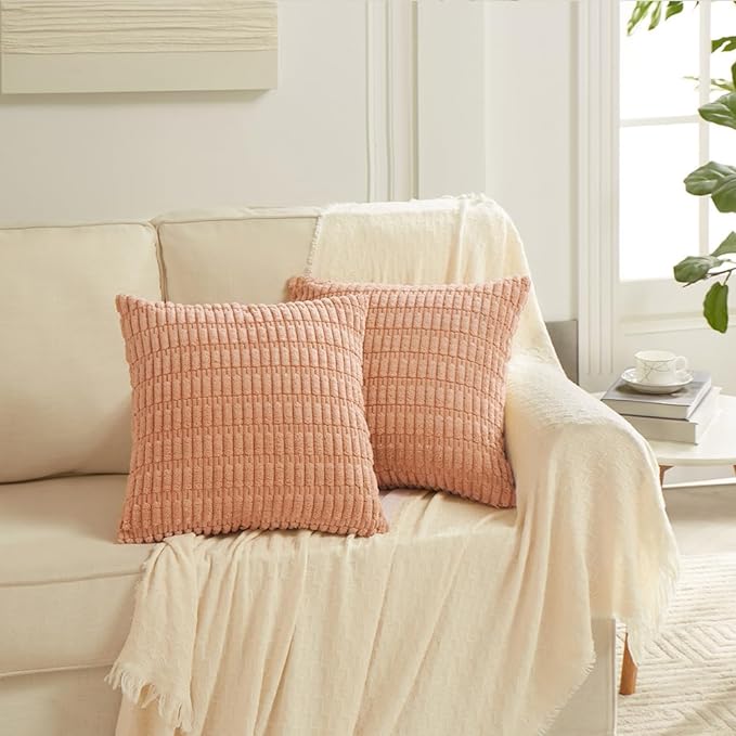
Find the perfect items for your living room with these inspo ideas!

Deck the walls this holiday season!

Because your room deserves some Xmas spirit too.
You don’t have to drop tons of cash for a cute apartment!
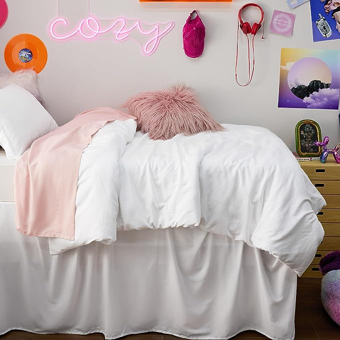
Transform your dorm with the cutest items and top decorating tips.

Because you don’t have to spend a lot to have a gorgeous apartment.