This post will give you tips on how to create color block outfits.

Fashion is fun. Styling an outfit is an amazing way to get your creative juices flowing. But, sometimes (and for some of us), it can be overwhelming. Look, I get it. it’s a fast-paced, ever-changing industry. Trends and styles come and go in the blink of an eye. It can be too much to handle if you are dipping your toes in the pool of fashion for the first time.
I’m here to help.
In this new series, I’ll give you styling advice on some of the most confusing and difficult styling areas. I’ll lay out all my tips, tricks, and hacks to help you create amazing outfits. Also, I’ll exemplify everything in three degrees of difficulty so it can be easier to see what you can do.
This week, I’ll give you all the tips and tricks for creating color block outfits.
Table of Contents
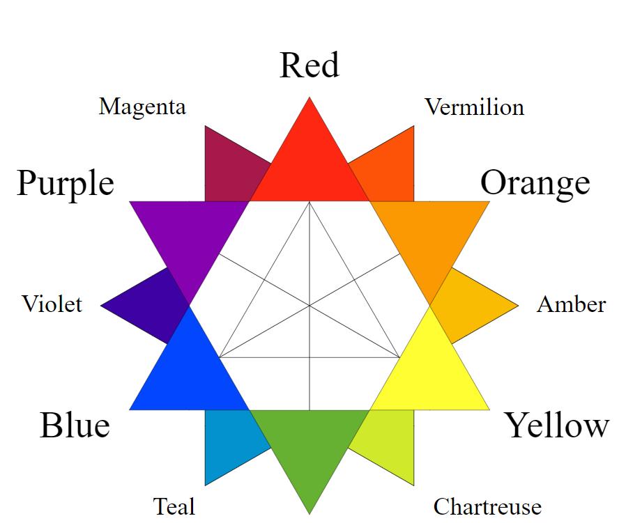
What is color blocking?
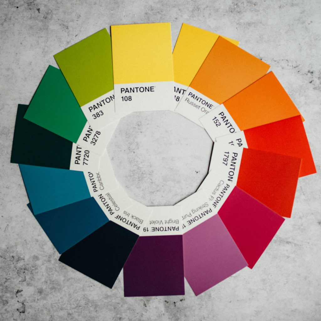
In art, color blocking means taking colors that are on opposite sides of the color wheel and putting them together to create contrast. For example, you could mix yellow and purple, or blue and orange.
The most iconic example we have of this came from Dutch painter Piet Mondrian, with a movement he called Neo-Plasticism. Mondrian maximized simplicity with abstract-but-geometric art. Solid blocks of color were used by the artist to create contrast.
While the origin of color blocking is debated to this day, Mondrian’s work popularized the concept enough to be called its inventor. He is such a key part of the movement that Yves Saint Laurent based an entire fashion collection off of his works for the Fall/Winter Collection of 1965-1966.

The Mod trend of the 1960s brought color blocking into mainstream fashion. Just search for a photo of Twiggy during her prime and you’ll have the perfect example of what I’m talking about.
Since then, color blocking has been a staple of fashionistas around the world, no matter the trend cycle we are in.
How to Create Color Block Outfits: Tips, Trick, & Hacks
So, let’s break it down into simpler terms. In fashion, color blocking is about wearing items in blocks of colors that “clash” or create a strong contrast.
It sounds pretty simple, but it can feel daunting to wear a complete outfit in bright colors. Here are a couple of things I’ve picked up along the way to help you navigate color blocking:
- Let it shine – Loudness and brightness are key parts of this style.
- Art 101 – To do color blocking and do it comfortably and cohesively, color theory is your best friend. Remember your earliest art classes with the color wheel? That’s basically all you need to create a cool color blocking look. (See our guide to how to mix colors in your outfits for more on this!)
- Two to three – Try to choose only two to three colors. Most of the time, people wear only two, but sometimes a third color is introduced to create an accent or complement the other colors.
- Prints & Patterns – Color blocking is usually done with solid items, but patterns and prints can be useful too. Just make sure the dominant color is a bright color. Preferably, the print or pattern will be in a lighter or darker hue of that color, in the opposite color you are going to use, or in neutrals.
- What about neutrals? – Neutrals take a back seat in color blocking. But they are still used to create lines, balance the look, or give the illusion of even more contrast. You can still create bold color-blocking looks with neutrals, especially with black and white, but the result is not as striking.
Color Block Outfit Examples
Since color theory takes a bit more of space and explaining, I decided to break down the inspiration looks into categories. The categories below are based on the color theory and color wheel, and I’ll explain each one, the colors they encompass, and then show some example outfits.
With that being said, let’s get to color blocking!
Primary color outfit
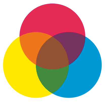
The primary colors are red, blue, and yellow. These colors can be combined to make other colors, but primary colors cannot be created by mixing other colors together. Basically, this means that every other color is created with some combination of these three.
To create a color-blocking outfit using these colors, you literally just need a piece of item in each of the primary colors.
If you want to create an outfit with primary colors, a good way to start is to use blue jeans as your base. Grab the bluest pair that you have, and stay away from really dark (almost black) or really light (almost white) jeans.
Build the rest of the colors around that item. You might have a red sweatshirt or blouse and yellow accessories. Or it might be the other way around. Play with these colors and combinations and be confident because primary colors work together no matter what.
The only tip I have is to try to use bright shades instead of jewel-tones or pastels because those are no longer primary colors and are harder to pair together cohesively.
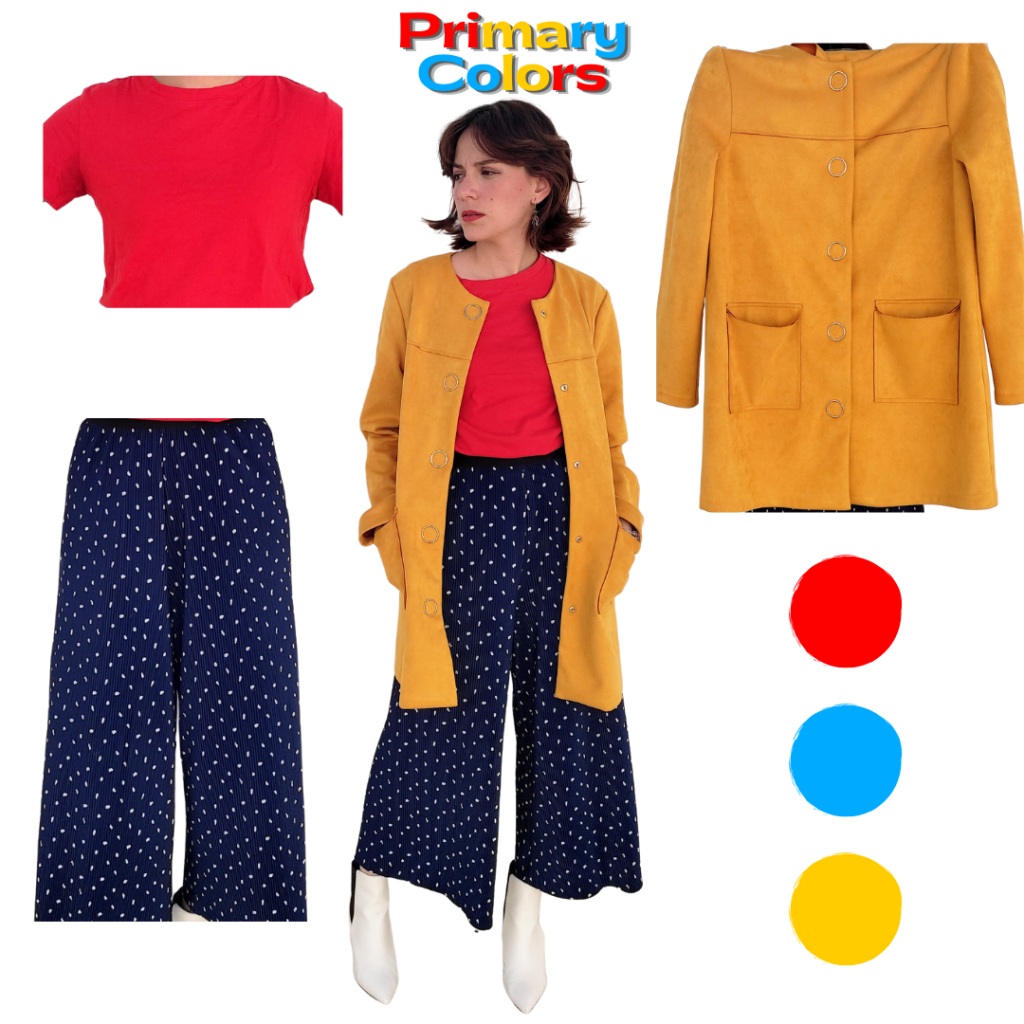
For my primary color outfit, I wore a bright red t-shirt and tucked it into a pair of flowy, wide-leg pants. The pants are blue and have a minimal white dot print. To finish the color palette, I threw on a mustard yellow coat. I had other yellow items, like sneakers and sweaters, but I wanted something that would be big enough to create a contrast with the red and blue items.
To finish the outfit, I decided to wear a pair of white booties. The booties tie in with the white dots on the pants and balance the rest of the colors.
Secondary color outfit
A secondary color is made by mixing two primary colors. So, our secondary colors are purple, orange, and green.
Here is where things get tricky for a lot of people. For years, you might have heard that purple and green don’t go together, or that purple and orange are just “too Halloween” to wear seriously. All of these are absolutely false. These colors work together and they look so cool.
If you want to create a color block outfit with secondary colors, it’s actually super easy. My first tip is that you don’t have to use all three colors together to create the contrast you need. Pick and choose your favorite two if that’s easier for you.
My second recommendation is to remember you can use whatever shade of the color you want; it doesn’t have to be the *exact* color you see on the color wheel. For example, neon green and lilac look gorgeous together, and burnt orange and emerald are an amazing combination.
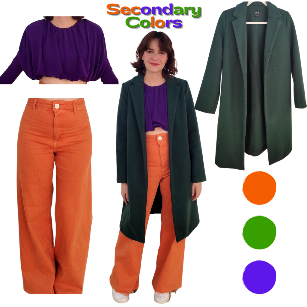
For my secondary colors outfit, I started with a purple, long-sleeved crop top. For pants, I wore wide-leg, high-waisted jeans in a slightly lighter shade of pumpkin orange. My green item is this gorgeous long wool coat in forest green. My shoes are a pair of white Nike sneakers to give the outfit a street-style vibe.
As you can see, the colors create contrast but do not clash. They work together because of the underlying primary colors that they have in common. The combo creates a cool color palette, while the different fabrics add dimension and make the whole look more interesting.
Tertiary color outfit
A tertiary color is made by mixing full saturation of one primary color with half saturation of another primary color. For example: red (full saturation primary color) + purple (half saturation of blue) = magenta.
Now we’re getting to the tricky part of color blocking. Tertiary colors, while not represented in the color wheel, are actually every other color, shade, and tint in between our primary colors and secondary colors. This means all the pinks, teals, ambers, pastels, neons, jewel tones, etcetera, encompass the tertiary colors. It gets trickier to pair them when you don’t have a direct line telling you what’s directly opposite of any given color.
My recommendation to start off with a look like this is to try to keep it in the same family. For example, pastels work great with pastels, so baby pink, baby blue, and baby yellow actually create a cohesive look. Neons work great with other neons.
Personally, I prefer to pair two bright colors with a third color in a jewel tone to add more dimension.
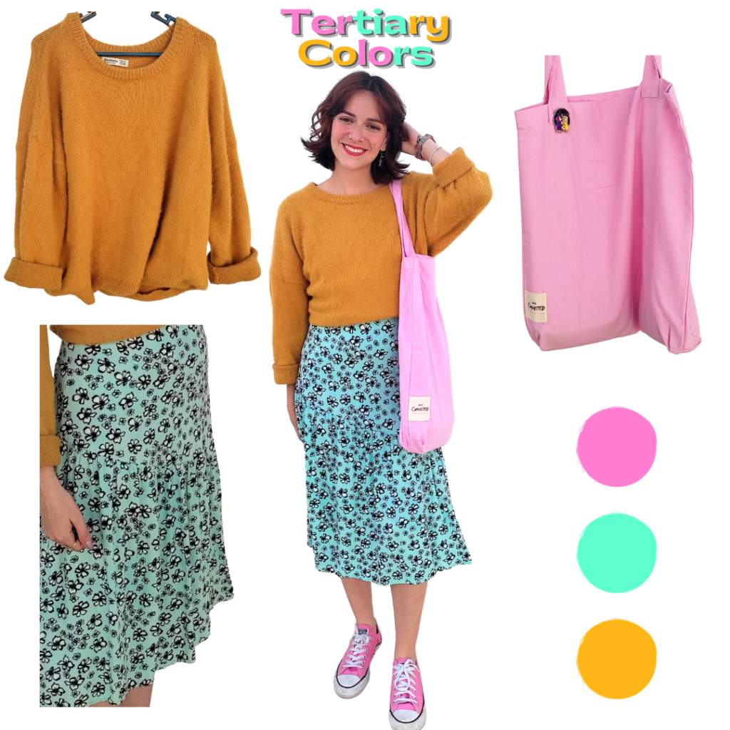
For my tertiary color look, I used a bright teal midi dress as a base. The dress has a really cute floral pattern in black and white, but the dominant color is teal. Then, I threw on a fluffy, oversized sweater in amber.
Since the outfit was pretty done and the sweater was too thick to layer under a coat or jacket, I decided to just accessorize with the third color. To do this, I wore low-top Converse and an oversized tote, both in bubblegum pink that matches the value of the bright teal.
This look creates the exact contrast that color-blocking is about without using the most obvious pairings you might see everywhere else. Those are the primary and secondary color combinations.
Complementary colors: Red + Green Outfit
In art, complementary colors are pairs of colors that, when combined or mixed, cancel each other out. The way we see this in fashion is that these colors, when paired, create the biggest contrast. They are often called opposite colors because they are literally opposite each other on the color wheel.
Three of the most important complementary color pairings are red and green, yellow and purple, and blue and orange.
The first pair we will tackle is red and green. (See our guide to wearing red and green together for a deep dive into this.)
This combination is difficult for me to wear for a bunch of reasons but the main two are: as a Mexican, these colors instantly make me think of my flag, so I avoid adding white to this so I won’t look like a giant flag. The second reason, and I think this goes for a lot of people, is Christmas. These are the Christmas colors, just like purple and orange are for Halloween.
But I assure you, there is a way to wear them without looking like a Christmas elf.
To create a red and green color block outfit, choose two items in bright shades. You might have a bright red beret or shirt, and a bright green pair of pants or sweatshirt. Then, try to balance the brightness with different shades of these colors or with patterned items.
Maybe you have a jewel-tone coat that works, in a deep red or emerald or a patterned sweater that has red as a dominant color. This way, it is easier to create cohesiveness and dimension.
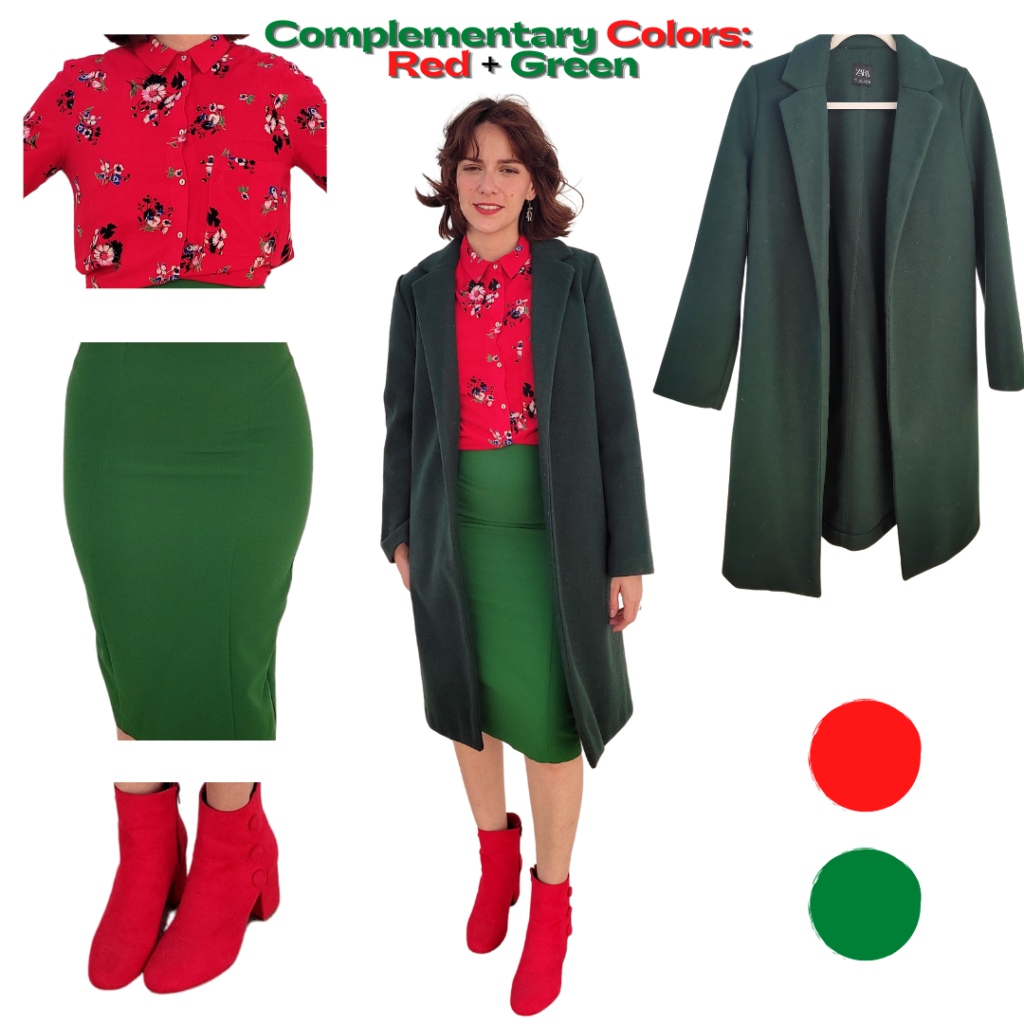
To create my red and green outfit, I used a bright green body-con dress to create my skirt. Then, I wore a red midi dress as a shirt and tucked up the rest of the skirt. The red dress has a floral pattern that helps tone down the Christmasy vibes the outfit may have. I decided to go all in and threw on the same forest green coat I wore for my second look and used my red suede booties to complete the look.
The contrast in this look is obvious. Unlike the others, there is no underlying primary color that connects them. Which is why, strangely, they work and look so cool. These are literally colors that clash, yet this contrast creates a unique, visually attractive outfit.
Complementary colors: Yellow + Purple Outfit
Our second complementary pair is yellow and purple. This is one of my favorite color combinations ever. It is probably right behind my absolute favorite one (pink and green) for me.
Just like red and green, yellow and purple contrast so much that it can be hard to envision them together sometimes. But I promise you can style them for a cool look!
To create a yellow and purple outfit, my best advice is to be bold. While pastels work great together and you’ll have a cute outfit in pastel yellow and lilac, this is the time to go for a bright purple and a neon yellow. The contrast you’ll get will be off the charts and it will look so fashionable and effortlessly cool.
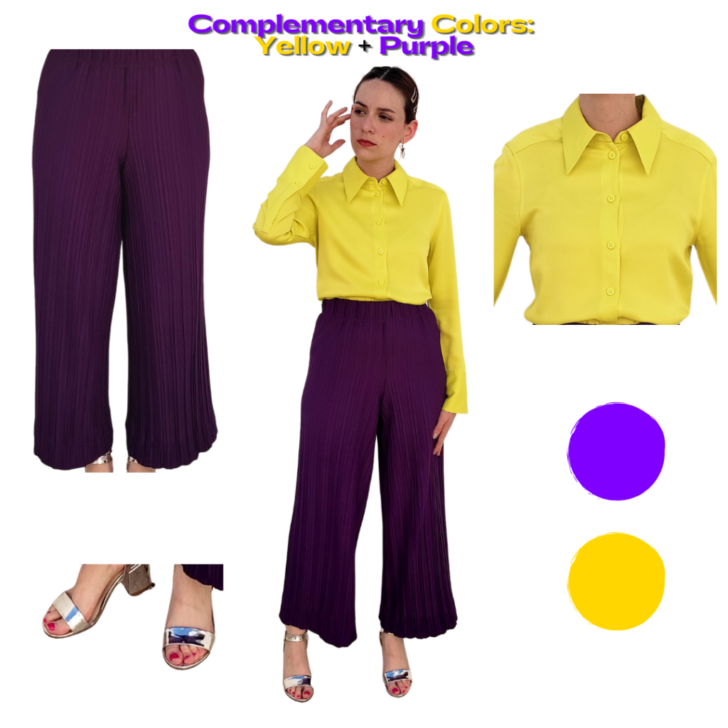
I took my own advice when creating my yellow and purple look. I began with a pair of wide-leg, purple chiffon pants. They are actually the matching pants for the purple shirt I wore in the second look. The pants have pleats, which add texture to the outfit. Then, I threw on a satin, neon yellow Oxford shirt. To finish the look, I wore a sleek pair of silver heels for another interesting texture.
Not only the colors are creating contrast in this look, but the fabrics also help balance things out. Chiffon is a flowy, matte type of material, while satin has a slight shine to it and it is more structured. Pay attention to the materials of your items, they will help you see what can go better with what.
This helped me figure out that my focal point was the shirt: it has the brightest shade of all, in a reflective fabric. The purple takes a back seat thanks to the matte fabric, but the pleats still add dimension. Since the shoes are like mirrors, they work perfectly with the items since they reflect both colors.
Complementary colors: Blue + Orange Outfit
Blue and orange is a combination that has been maligned for decades. One time, I heard someone calling it a Cheetos-type of pairing. Personally, I disagree.
Ok, I don’t know how many of you saw MTV’s Teen Wolf. I was a huge fan and I loved Stiles. And yes, this is relevant to our discussion.
One of the biggest lessons I learned from this fantasy teen drama show, and from Stiles specifically, came when Lydia said that blue and orange don’t go together. Stiles’ response?
You know, sometimes there’s other things you wouldn’t think would be a good combination, end up turning out to be, like, a perfect combination. Like two people together who nobody ever thought would be together ever.
Stiles Stilinski, MTV’s Teen Wolf.
And that’s the lesson you should take with you today: orange and blue look so good together.
It is baffling to me how people can say that when we wear blue jeans with orange items ALL THE TIME. Yet they still hate blue and orange as a combo. It makes no sense!
So if you want to dip your toes into color blocking and want to see how you feel about it first, blue and orange are probably your safest bet. As I said, blue jeans + an orange top is actually a color block outfit.
If you are going this route, just steer away from neutral accessories and cover-ups, and try to keep the color palette going with the rest of your look.
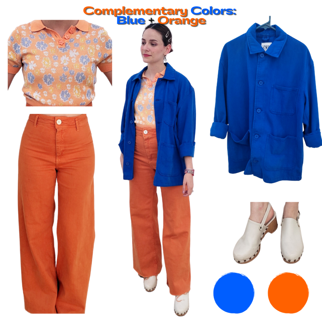
For the last of the complementary colors outfits, I went for an all-orange base. I wore a knitted polo shirt in light orange, with a light blue floral pattern. Then, I just used the same wide-leg orange jeans I wore in my second outfit.
For my blue item, I went with this bright royal blue shacket. To tie everything together, I decided to take a cue from the slightest hint of cream in the pattern of the shirt and picked out a pair of cream clogs as shoes.
Here we need to pay attention to the pattern. This pattern contains all the colors of the outfit and it helps the look to be cohesive. It is the item that ties everything together. But, just like the previous look, the fabrics also play a big role: the knit material of the shirt, the denim of the jeans, and the cotton of the shirt are all soft, matte materials. Since they are in the same family, the items look like they belong together.
Analogous colors: Yellow + Orange Outfit
Analogous colors are groups of colors that are next to each other on the color wheel. These color combinations lack contrast. For example, red, orange, and yellow (and the shades and hues sitting in between) are analogous.
We can see this type of combination when we talk about “warm colors” and “cold colors.” That’s the easiest way to break them down, but it is not the *only* way to do it.
Pairing these colors will be a walk in the park after the complementary ones. For this one, just follow your “warm” or “cold” color instincts. Which colors do you associate the most with the fall, for example? Which ones do you associate with winter? I’ve given you most of the tips you need: pay attention to your fabrics, to the family of colors the shade you chose comes from, and play with the fit and cut of the items.
FYI, analogous combinations are endless, way more than the three I’ll use here, but these are just examples of the type of combinations you can do.
It’s barely fall, but I’m already bringing my yellow, red, and orange sweaters out of the closet. The first combination of analogous colors I want to take inspiration from reminds me of fall, the changing leaves, and the Gilmore Girls’ intro. I’m going to tackle yellow and orange.
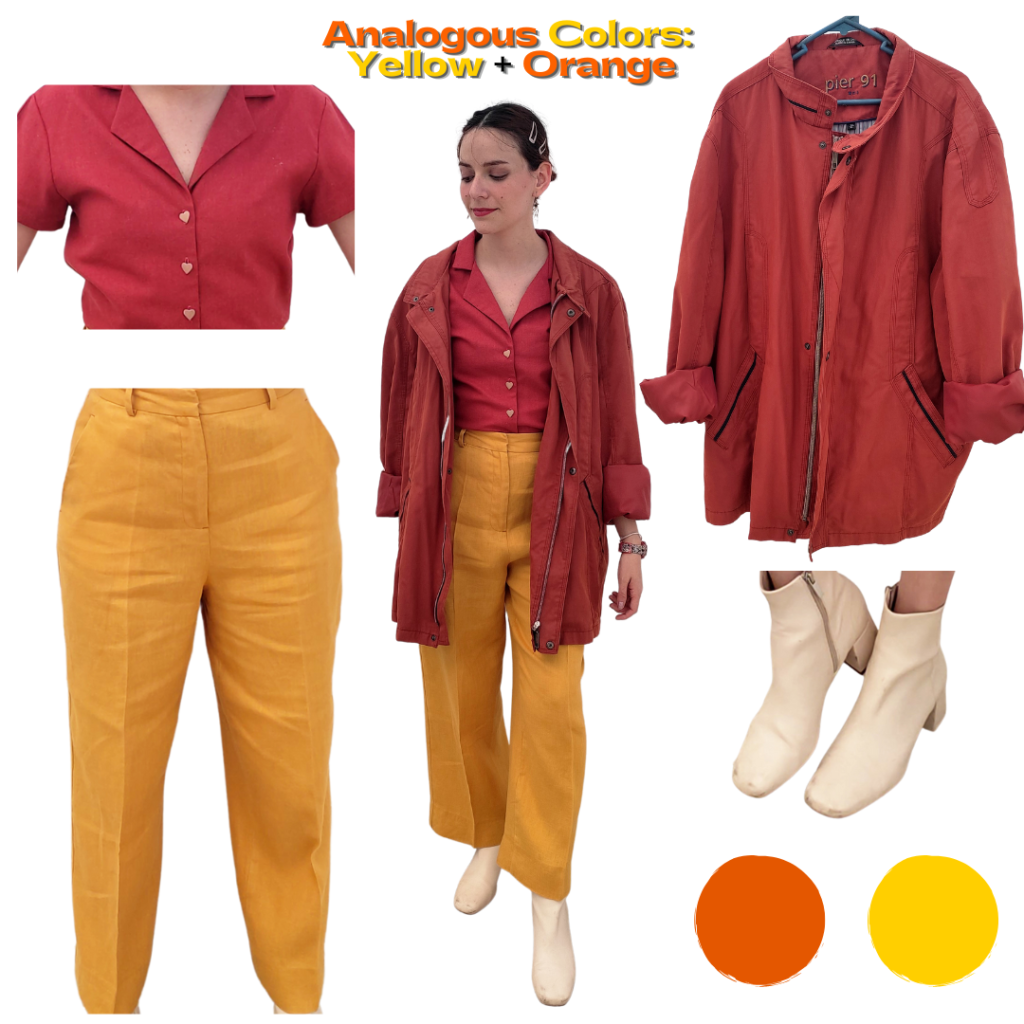
For my first analogous colors outfit, I decided to create contrast with the fabrics and colors. I paired a burnt orange linen button-up shirt with *another* pair of wide-leg pants, this time in a rich shade of golden yellow. The pants are also made of linen.
With all the linen, this might feel like a summer outfit, but I added a brick orange jacket (that’s actually my dad´s) and a pair of square-toe cream booties to transition it into a fall look.
As I mentioned before, it helps to play with the fabric texture when color-blocking. The colors I chose are very bright, warm-toned, slightly dark shades of yellows and oranges, mostly associated with the fall. In contrast with that, linen is a fabric used mostly in the summer, because it’s thin, breathable, and has a lot of movement.
The contrast between the colors and the fabrics creates an interesting juxtaposition to the look. But, what settles it into a cohesive fall look, are the jacket and shoes.
Analogous colors: Blue + Green Outfit
Another easy color combination in the analogous family is blue and green.
This combo is a staple in fashion. It is such a beloved pairing that a lot of the patterns and fabrics come with these two colors already matched together. For example, plaid. If the base is either a navy blue or dark green as a base, the plaid pattern is almost always created with shades of blues *and* greens.
This is one of the easiest color-blocking outfits you can create. You can pair (you guessed it!) blue jeans with a green top and either a blue or green jacket. With analogous colors like these ones, it’s way easier to be playful and experiment with patterns, accessories, and shoes. I’d recommend going for a blue-green look if you want to experiment with different patterns.
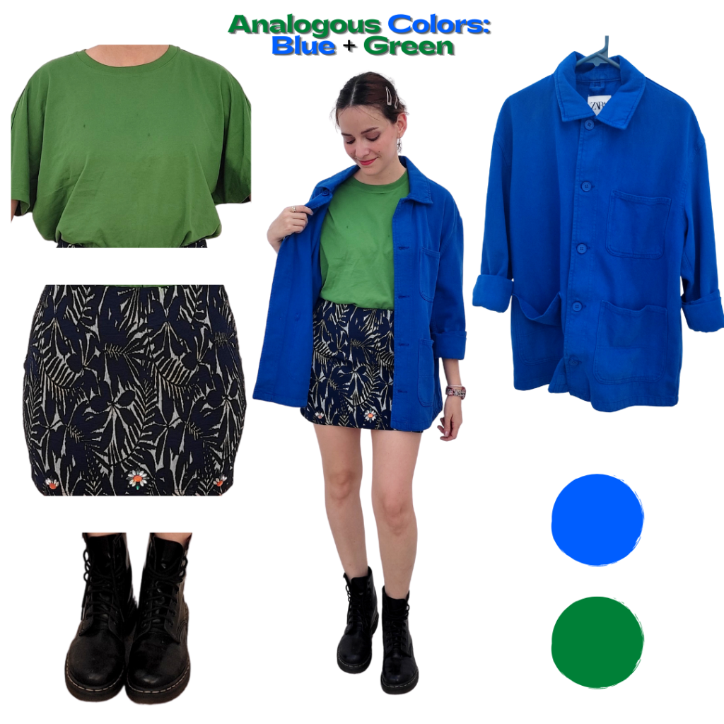
For my green and blue outfit, I started with a parakeet-green cotton t-shirt. For the bottoms, I wanted to add a playful pattern, so I chose a navy blue mini-skirt that has a plant pattern. The pattern is slightly outlined with neon green. Finally, I threw on the same bright royal blue over-shirt I wore in my orange-blue look. To make this look more modern and edgy, I put on a pair of black Doc Martens.
When you see a look like this, it just makes sense. Blue and green are heavily associated in nature, so it’s only natural that it’s visually cohesive to see them together.
Analogous colors: Pink + Red Outfit
This post wouldn’t be complete if I didn’t add pink somewhere in here, right?
Our next analogous pairing is pink and red. Just like orange and blue, pink and red was a fashion no-no for years! It was on the forbidden list, along with blue and brown. But thanks to the resurgence of pink, especially with the Barbiecore trend, pink and red have become the new hot pair to use if you want to color-block your outfit.
This one might look easy, but you have to be a bit careful with the shades you choose. To make it easy, I’d go for either bright shades all over, or an incredibly bright red and a very pastel pink. When red isn’t at its brightest, it might look like pink. So, it ends up looking like a monochromatic outfit, which is cute but is the exact opposite of what color-blocking is about.
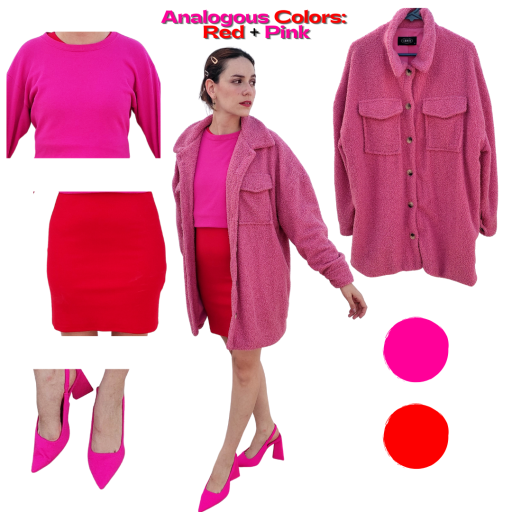
For my pink and red look, I wore a bright red body-con dress as the base for the outfit. Then, I put on a hot pink sweatshirt and tucked it in a bit to make it appear cropped. Then, I threw on a fluffy, oversized pink jacket. As a finishing touch, I added a pair of hot pink stilettos.
Hot pink and bright red look bomb together! And it is so easy to make them work together because hot pink is mostly red. Tucking the sweatshirt makes the amount of red and pink equal in the base of the look. The jacket has a lot of texture and the fit complements the tightness of the skirt. I absolutely love this look!
What do you think of these color block outfits?
Do you like color-blocking? Which of these looks do you like the most? Do you have any styling questions you’d like me to cover? Let us know in the comments below!