I got color analysis and dressed in “my colors” for two months. Was it worth it?
We’ve all seen the testimonials about life-changing color analysis, as well as the words of cynics saying it doesn’t matter what you wear.
So, for two months, I embarked on an experiment.
I went to a professional color analysis service, got my best color palette, and used it to create my outfits and do my makeup.
Below, I’m sharing my full color analysis experience and whether it’s worth it to have professional color analysis done. Read on to learn all about color analysis and whether you should do it!
Table of Contents
What *is* seasonal color analysis?
Color analysis is a term often used within the cosmetics and fashion industry to describe a method of determining the color palette that harmonizes with someone’s skin complexion, eye color, and hair color to apply to clothing, makeup, and hair styling.
The general idea is that the wrong colors won’t enhance someone’s features, while harmonious colors will bring up their natural beauty, making them appear healthier, brighter, and possibly, more attractive or put-together.
Seasonal color analysis divides people into four categories inspired by the seasons: Winter, Spring, Summer, and Fall (Autumn).
Originally, the divides were pretty distinct between each season and didn’t account for possible overlap. This model didn’t account for POC either. So, it was refined and redeveloped into 12 overlapping seasons to make the system more flexible and approachable.
Color Analysis: The Seasons and Sub-Seasons
The twelve seasons color model acknowledges that the seasons overlap or flow into each other. Like they do in nature throughout the year. Three aspects of color are taken into account:
- Warm or cool (temperature)
- Light or dark (value)
- Bright or muted (chroma)
Spring features are warm, bright, and light. The Spring season is divided into three sub-seasons: Bright Spring (transition from Winter), True Spring, and Light Spring (transition to Summer).
Summer features are cool, light, and muted. The Summer season is divided into three sub-seasons: Light Summer (transition from Spring), True Summer, and Soft Summer (transition to Autumn).
Autumn features are warm, muted, and dark. The Autumn season is divided into three sub-seasons: Soft Autumn (transition from Summer), True Autumn, and Dark Autumn (transition to Winter).
Winter features are cool, bright, and dark. Winter season is divided into three sub-seasons: Dark Winter (transition from Autumn), True Winter, and Bright Winter (transition to Spring).
Color Analysis Experience: My Predictions VS. Professional Results
I have been down the seasonal color analysis rabbit hole every couple of years since I was old enough to read Teen Vogue and Seventeen.
After some online quizzes, YouTube research, and a lot of time examining my face in the mirror (always in natural light), I placed myself in the Winter season and Dark Winter sub-season.
I theorized that would be it because I have high contrast in my features, a neutral undertone, and could always carry black, white, and bright colors well.
Turns out, I wasn’t that far off — but I was off. My analysis resulted in Dark Autumn.
When I got this, I was kind of disappointed. As you know, I love bright, highly contrasting colors, and my wardrobe is, apparently, everything but muted. This is why I was biased towards the Winter season.
Then, I saw the actual palette they sent me. I realized I already had a bunch of Dark Autumn colors in my closet, and the blow was softened.
Dark Autumn VS. Dark Winter
Dark Autumn the sub-season that combines dark and warm, and transitions from Autumn to Winter. Both Dark Autumn and Dark Winter have dark as their primary aspect.
The distinguishing feature between them is the secondary aspect: Dark Autumn is a neutral-warm season, while Dark Winter is neutral, leaning cool.
This explains a lot.
Since Dark Autumn is a transition season, I can carry Winter colors without them looking off on me and kind of get away with wearing high contrast, bright colors, and cool metallics like silver.
Colors in the Dark Autumn palette are rich and deep more than bright. The Dark Autumn palette is reminiscent of spices. Think of the burnt orange, cozy chocolate brown, the golden hue of cognac, turquoise, mustard yellow, and tomato red. Since Dark Autumn is warm leaning neutral, it means gold and rose gold are more flattering to me than silver.
But the question remains. Is color analysis worth it? Or even, does it work?
Trying Color Analysis: My Experiment Guidelines
This is the sort of thing I needed time to really see if it actually has any sort of impact. That’s why I landed on the 8-week timeline in which I would try color analysis.
Also, for the sake of this experiment, I created a set of guidelines to do it right and give it a fair shot:
- Each week, use the color analysis palette for 6 days. But, for one day, I did not use my color palette and tried to use one of the more contrasting palettes (Light Spring and Light Summer mostly) to compare how much it affected the way I looked. We can call this my “Control Outfit” day.
- Be as secretive about it with my immediate circle as possible. I told only four people (my mom, my sister, my boyfriend, and my best friend), but no one else. This way, I can see how saying you’re in your best colors affects how others see you versus just wearing the palette and seeing if there’s an apparent, unbiased reaction to it.
- No shopping. Since I realized I had a ton of my color palette already and wasn’t sure if I wanted to continue wearing Dark Autumn shades, I vowed not to buy items with the explicit intent of having a Dark Autumn wardrobe for this time period.
- For spontaneous shopping, I tried to follow the color palette and only if it was a coveted or needed item.
- Follow the color analysis without altering my personal style. My colorful, eclectic, shiny style will remain throughout the experiment.
Color Analysis Experience: Dark Autumn, Month #1
Color Analysis – Dark Autumn, Week #1
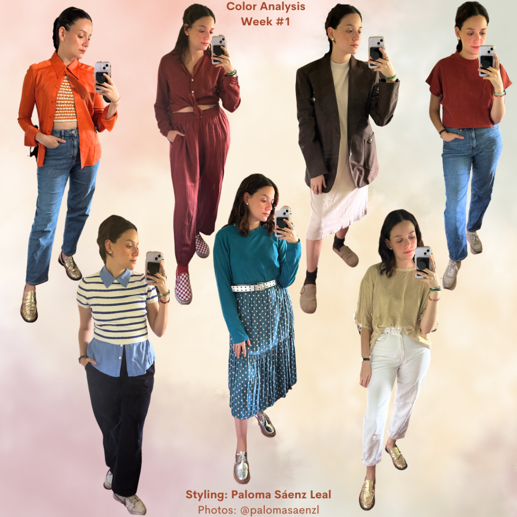
The first week I was still getting over not getting a Dark Winter (or any Winter) palette.
As you can see, I went straight to the stereotypical Autumn colors: brown, gold, and orange. That week, I had a ton of things and events planned. I had my boyfriend’s birthday celebrations through the first few days and a trip planned by the end of it.
Having a smaller range of options to work with that week saved me a lot of time (and space in my suitcase).
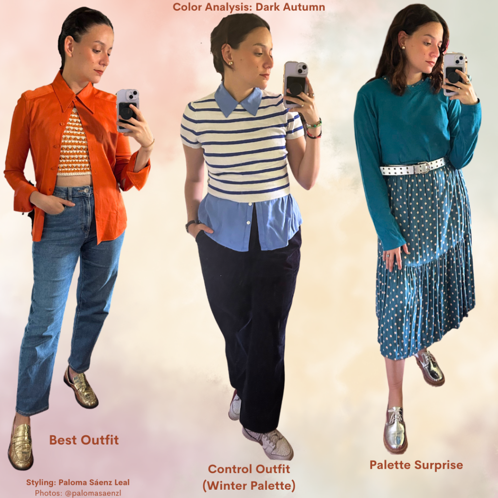
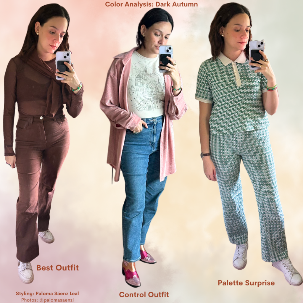
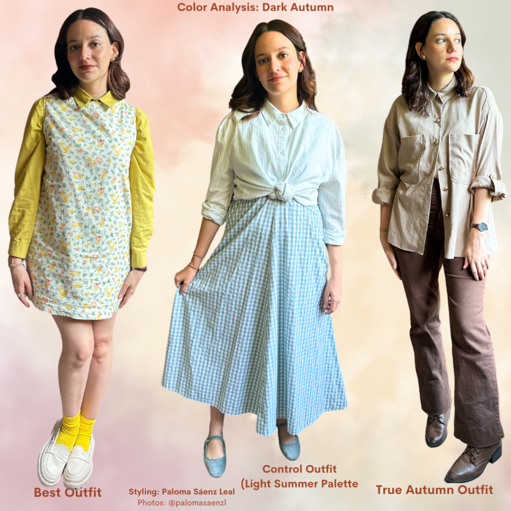
Best Outfit of the Week:
I loved most of my outfits that week, but my favorite was the first one.
I wore an off-white and orange crochet crop top and medium-wash blue jeans. Then, I threw on an orange satin shirt. My shoes were a pair of gold loafers. For my makeup, I used bronzy and muted colors and brick-colored lipstick.
Honestly, I do believe I was glowing in this outfit, and I really loved how it looked.
Color Palette Surprise:
My first surprise when I got my palette was the amount of blues that it had in it. Teal wasn’t even on my radar as an Autumnal color. But yes, Autumns can wear blue!
I was very excited when I could wear a completely teal outfit with my midi polka dot dress and a long-sleeved, crew neck shirt. I accessorized with a silver belt and put on silver shoes.
Tip #1: As long as you wear them away from your face, you can get away with colors that are not necessarily in your seasonal color palette.
Control Outfit:
My control outfit was the second one I wore that week. It’s within the winter palette, with cool tones throughout.
I wore a blue sleeveless shirt and layered it with a knitted, white, and royal blue striped shirt. For pants, I opted for a pair of navy blue corduroy trousers. For shoes, I put on a pair of white sneakers.
I don’t know how much it worked to have a control outfit when I wore it after a very late night out celebrating my boyfriend’s birthday. I didn’t sleep much and was very tired throughout the day, which could affect how I looked more than the outfit itself. Suffice to say, this wasn’t a winner.
Color Analysis – Dark Autumn, Week #2
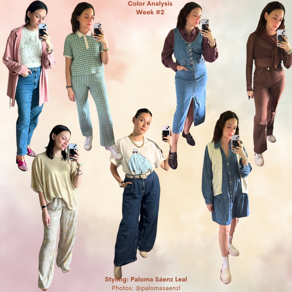
This week started with a bang, literally. I traveled to Mexico City for four days and went to see Taylor Swift make history for the first time in my country.
My first outfit was the one I wore to the concert. I had planned what to wear for months before I even got my seasonal color palette, so it had to be my control outfit.
This week, I tried not to wear brown or orange as much as the first week.
Best Outfit of the Week:
As much as I tried to stay away from brown this week, the all-brown outfit from my last day was my favorite.
For it, I wore a brown mesh top with a pair of brown high-waisted jeans. It had been raining, so I threw on a brown sweatshirt just in case. Finally, I accessorized with my usual gold jewelry and put on a pair of white sneakers with brown details.
Color Palette Surprise:
The Autumn color palette also has a surprising amount of greens and almost-white hues, like ecru. Both of which I thought were more of a Summer palette thing.
Pleasantly, I could wear one of my favorite lazy-day stylish looks without breaking the rules.
For this look, I wore a polo shirt and matching pants. The set is knitted and the pattern is in dark sea green and ecru, both of which are in my Dark Autumn Palette. Finally, I wore a pair of white Adidas.
Control Outfit:
As I mentioned earlier, my control outfit had been planned for months, so it doesn’t follow a specific palette.
For it, I wore a very light beige baby tee with a very delicate graphic. Then, I threw on a light pink, glittery shirt. For bottoms, I went with medium-wash jeans to be comfortable in the venue. Finally, I added metallic pink cowboy boots.
What can I say? It was a Taylor concert. With this one, you can see these aren’t my best colors, I think they’re too light and there’s not enough contrast.
My sister and I wore matching shirts to the concert and that was more important to me than wearing my seasonal color palette.
Color Analysis – Dark Autumn, Week #3
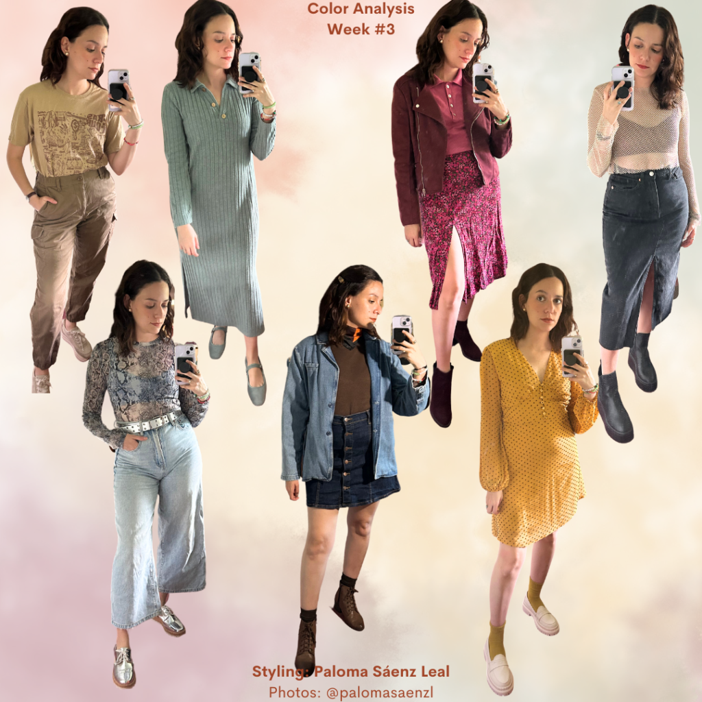
On week three, I started experimenting more with non-brown or brown-related colors.
I tried to have a broader spectrum of color, so I went for more types of blue/greens, pinks, and yellows.
This was also the first week that I looked for additional Dark Autumn color palettes online, just to give myself a more complete idea of what my best colors actually include.
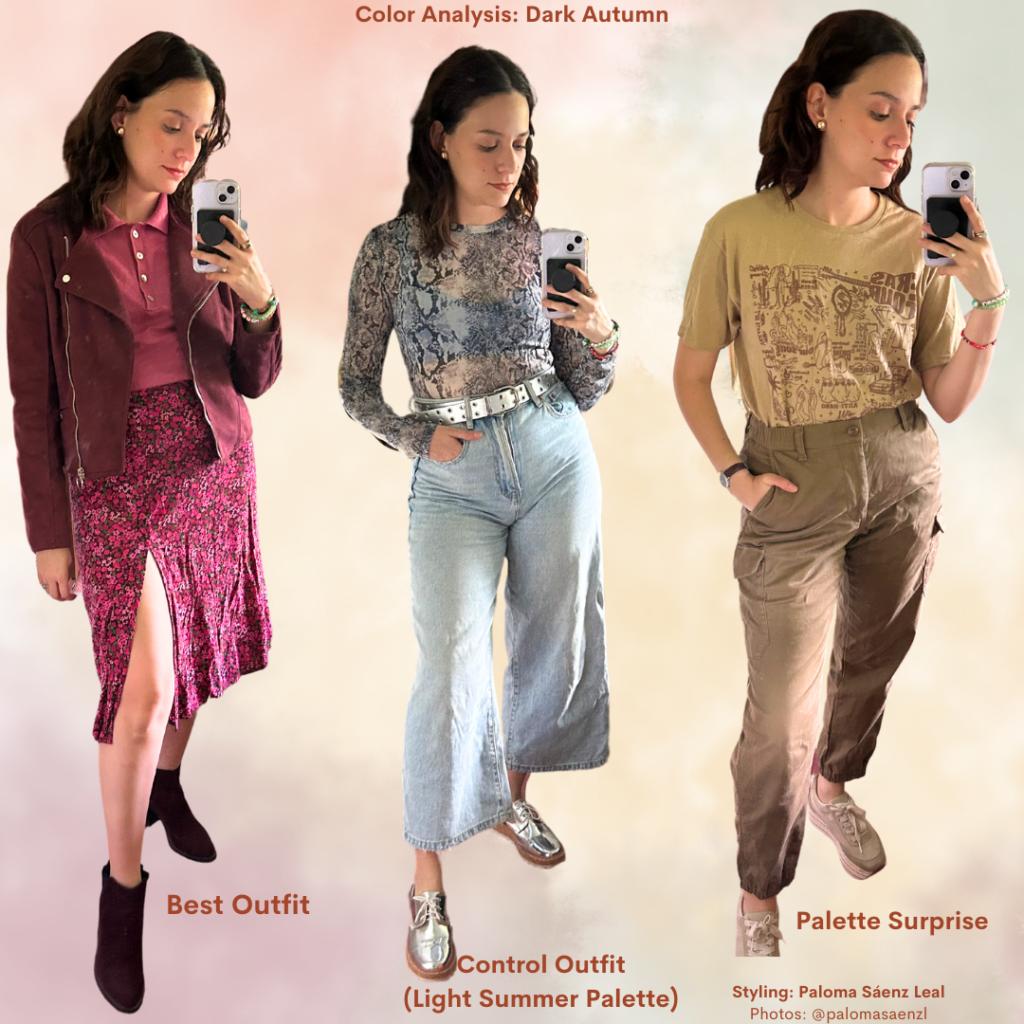
Best Outfit of the Week:
The best look of the week was, by far, the pink and burgundy outfit.
One of the biggest disappointments for me, when I got my color analysis results, was the very limited range of pinks included in my palette. You know it’s my favorite color and pink, specifically bright pink, is a staple in my closet.
Having a chance to include it through the floral pattern of the skirt — without losing the deeper raspberry shade of the knit polo top — was a step in the right direction for me. Complementing both with a burgundy suede jacket and burgundy suede boots really took this to another level.
Color Palette Surprise:
For years, I’ve been sure that beige is one of the worst colors I could wear. My reasoning is that I’m too pale to handle it, so I don’t wear it on its own.
But the first outfit with the beige graphic t-shirt and cargo pants, was actually really cool and I didn’t feel like the color drained me.
I really started to warm up to the lighter side of the Dark Autumn palette with this look.
Tip #2: A color palette is that: a palette. Of course, no service can send you the thousands of possible colors that could be in your palette. There’s an entire color wheel of colors you can use and you can look for additional palettes from your season online.
Control Outfit:
For this outfit, I used the Light Summer palette, which is on the opposite side of the spectrum from my Dark Autumn palette.
My control outfit was the second one of the week: a light blue mesh top, light wash culotte jeans, and silver accessories.
I wouldn’t say I looked bad in this — it was a fun outfit — but I do think I would need a bit more contrast to really love this look.
Color Analysis – Dark Autumn, Week #4
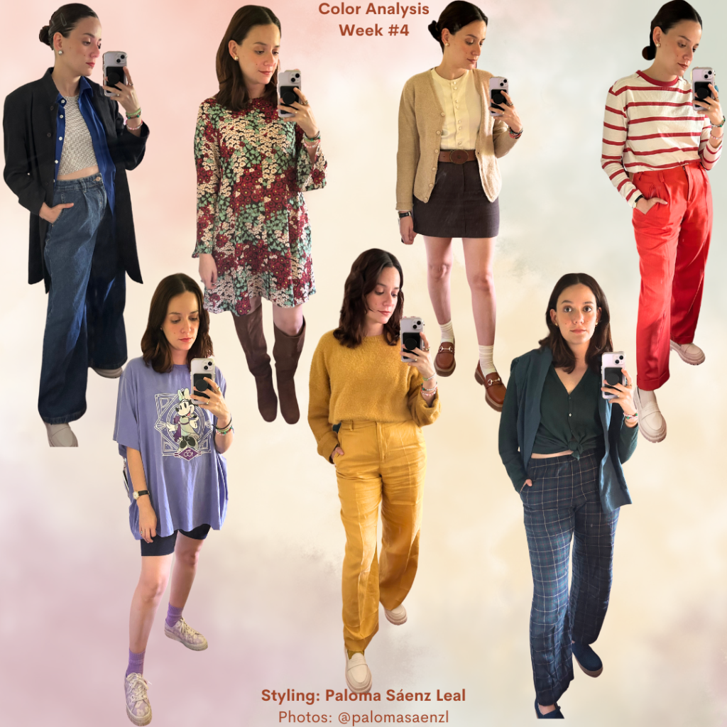
Week four! Although I loved most of the looks, I felt like my personal style was getting lost amidst all the neutral colors. So, midweek, I searched Pinterest for colorful, eclectic outfits with the Dark Autumn palette.
I managed to find a lot of inspiration from people with a similar style to mine and creativity came pouring out for me (finally!).
Also, I wanted to try and use the cooler colors in my Autumn palette. These were the purples, greens, and blues that had the least amount of yellow on them.
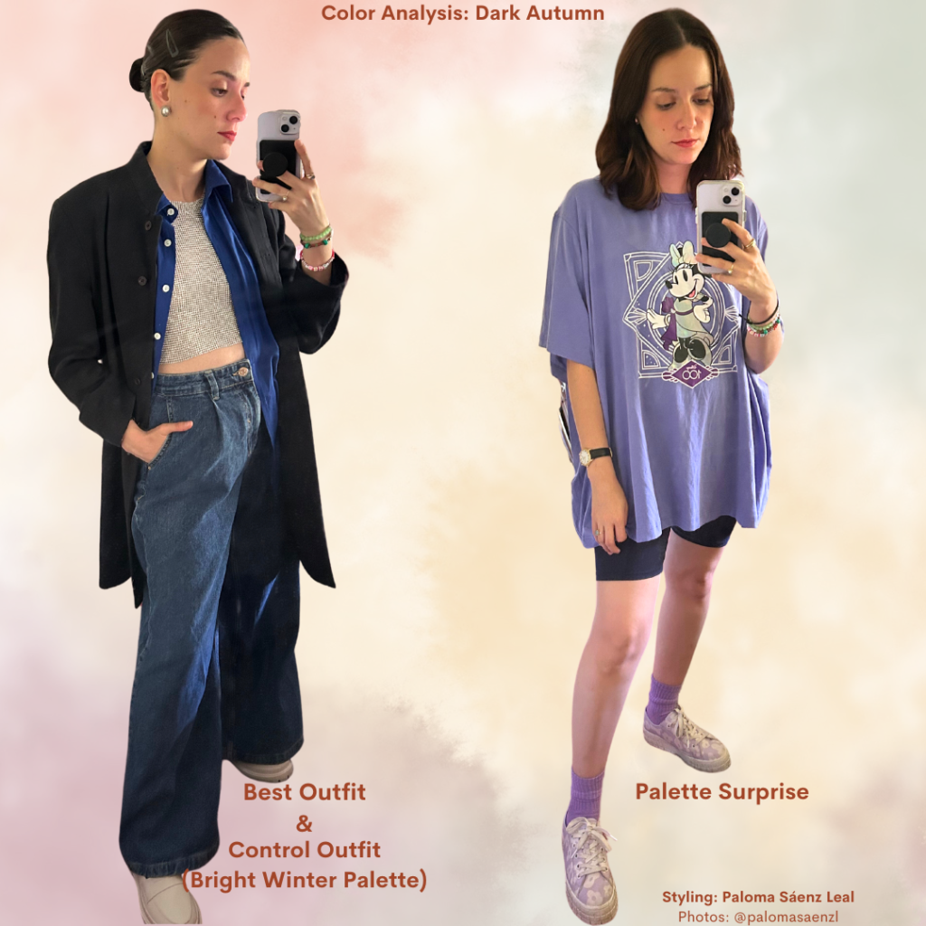
Best Outfit of the Week:
My favorite outfit of the week was difficult to choose because there was a lot of variety. But I think it was, surprisingly, my Control Outfit.
I wore this outfit on Saturday when I attended a concert and a birthday party, so it’s a bit dressier than the rest. Maybe it’s because of the chainmail top which is such a unique and beautiful piece, but this is an outfit that has been stuck in my head ever since I wore it.
Color Palette Surprise:
The biggest surprise for me this week was the shade of purple I wore on the second day.
I assumed that this t-shirt was a no-go for Dark Autumn because I thought that it was a Winter or Summer cool-toned color. However, there’s a purple shade in my color palette that exactly matches the color of the shirt.
It was Sunday, so I wanted something really simple and easy. I wore an oversized purple graphic t-shirt, blue biker shorts, lilac socks, and lilac sneakers.
Control Outfit:
For my control outfit, I used a Bright Winter palette as a guide. This is the Winter palette furthest from my own.
I wore a silver chainmail top and a bright royal blue shirt. For pants, I chose a pair of wide-leg dark-wash jeans. It had been raining, so I used one more layer with a navy blue coat.
Finally, I just put on a pair of off-white chunky loafers and accessorized with silver jewelry.
Color Analysis Experience: Dark Autumn, Month #2
The first month was over, and I had been settling into my color wheel very well. I could actually see a difference when I was wearing dark, warm colors. Also, I was looking for inspiration for my color palette.
Of course, this means that I got bombarded with ads and suggested posts from other color analysis services and accounts everywhere.
I browsed through them because these services use celebrities and clients as examples, and it helps to see the seasons applied in real life. But, I also saw that while they agreed on *almost* everything, sometimes they categorized some celebrities differently.
And I got curious.
Would a different service categorize me in a different season?
So, at the start of the second month, I hired another color analysis service. I wanted to see if they either confirmed that I was a Dark Autumn or if they categorized me in a different season. And if they confirmed it, how would their color palette compare to the first one?
I got my results in the middle of the fifth week: True Autumn.
True Autumn VS. Dark Autumn
Having my colors done the second time was almost the same process — I even used the exact same photos for both services. The only thing that changed is that with the second one, they sent me a questionnaire.
I had to confirm the following: my natural hair color, my eye color, whether my skin burns or tans in the sunlight, and my preferred metal (silver or gold).
The second service categorized me as a True Autumn, right in the middle of the Autumn season.
True Autumn combines warmth with softness and is the warmest Autumn season. True Autumn is considered warm and muted, with medium contrast in my features.
Warmth is the primary aspect of True Autumn. My features blend together, giving an overall soft appearance and an overall low saturation.
In general, I was relieved to see that at least they agreed on my season: Autumn. This means that warm colors suit me better than cool colors overall and that I carry dark and muted colors very well.
But, my issue comes because they *are* telling me different things: True Autumn is soft (more muted, less saturated), while Dark Autumn is dark (less muted, more saturated).
It threw me off for a bit.
At first glance, I believe the first service was more accurate to my features. But, for the sake of the experiment, I swapped in the True Autumn palette one day per week, just to see if it worked for me.
So, now I’ll be wearing the Dark Autumn palette for five days, the True Autumn Palette for one, and one day for my Control Outfit.
Color Analysis – Dark Autumn, Week #5
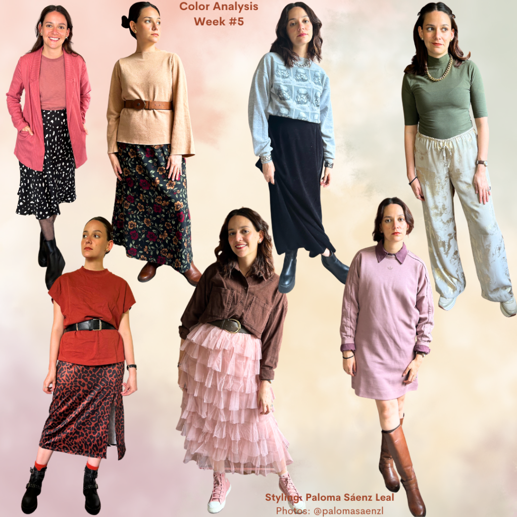
As I explained above, I changed the experiment’s rules this week.
It was a good shift for me because the initial perks of the analysis were starting to wear off. Especially this week, I often thought of something to wear, only to remember that I either had to layer with something Dark Autumn or True Autumn-related or change my initial idea completely.
It also coincided that the weather didn’t help, and it was the hottest it had been since mid-July. Unsurprisingly, most of the items I have in the Dark Autumn palette are for, well, Autumn and Winter.
Best Outfit of the Week:
Despite the weather limiting my outfit choices, I found cool ways to wear my clothes, and my favorite outfit this week was this orange ensemble.
I wore a burnt orange T-shirt with an orange animal print midi skirt. Instead of tucking in the tee, as I would usually, I left it out and cinched it with a black belt. Finally, I used a pair of orange socks and black booties to tie everything with the skirt’s pattern.
I loved how this made me look; I think it was really fun and colorful without leaving the warmth or depth of the Autumn colors.
True Autumn Palette:
Now, for my True Autumn outfit, I kept the warmth but switched the palette for something softer.
This beige sweater matches almost perfectly with one of the light neutral colors the second analysis provided. I’ve had it for years, and I usually wear it with a darker or brighter color underneath because I see that I blend in too much with the sweater and not in a good way.
I’m already pale, and this sweater made me look sickly. This was my least favorite outfit.
Control Outfit:
On the other hand, this True Winter grey sweatshirt made me happy. I loved the whole outfit!
I do think this light-ish grey is not my best color. But I like how it looks on me better than a light beige.
Color Analysis – Dark Autumn, Week #6
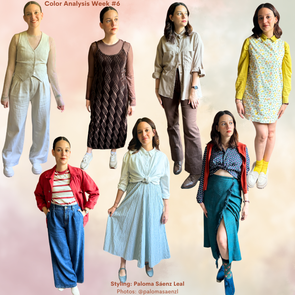
Week six arrived, and the weather was still too hot for most of the items I have in a Dark Autumn palette. But I pushed through it and tried to find new (breathable) ways to wear my outfits.
This week, I decided to take my complaints from the week before and turn them into a strength.
I experimented more with layering other colors with my Dark Autumn ones to expand my outfit options and saw my palette’s lighter, neutral side as more of a fun challenge.
Best Outfit of the Week:
For me, the best look was the last yellow outfit.
I wanted to wear that floral dress, but the base color is not in my season. So, I layered it with a mustard yellow shirt. Then, I continued the palette with a pair of off-white loafers and yellow socks.
This look was the one that convinced me not to quit on this. It is a fun, colorful, eclectic look that perfectly encapsulates my style. I finally felt like I could continue wearing my favorite items through this experiment without compromising in any area.
True Autumn:
Once again, the True Autumn outfit was just not it for me.
The beige shirt I wore is lighter and softer than the tops I usually wear. Usually, when I wear it, I layer it with something darker underneath or on top. The brown jeans are always top-notch, but I felt something was lacking in this look. I was a bit uninspired that day, too, so that could be it.
Control Outfit (Light Summer Palette):
My control outfit was actually in my top three favorites this week (along with the yellow outfit and the off-white monochromatic one). I decided I’d wear this light teal blue ensemble as my control.
Just a note, this is the first time someone commented on the color first when they saw me. They said the color was cool but nothing about how it looked on me.
This is something they say in color analysis: in the right palette, people should see you first and not your clothes.
Color Analysis – Dark Autumn, Week #7
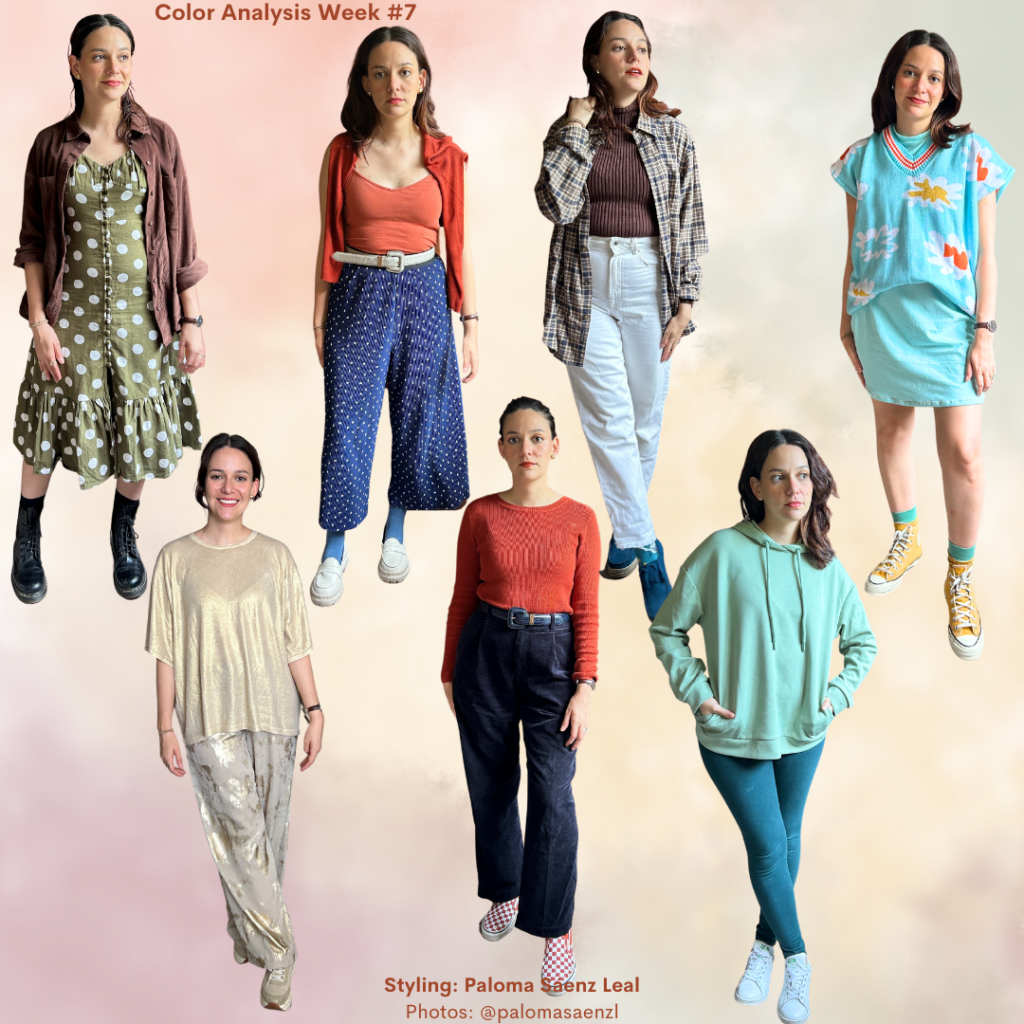
Week seven arrived, and the color analysis had truly settled in my mind. During this week, I realized that distinguishing between cool, warm, bright, and muted had gotten easier. This also helped me work with layering and using different items that I hadn’t worn before.
The weather helped a bit since this was the week it started getting colder (finally!), so I could wear more of my knitted items and flannels.
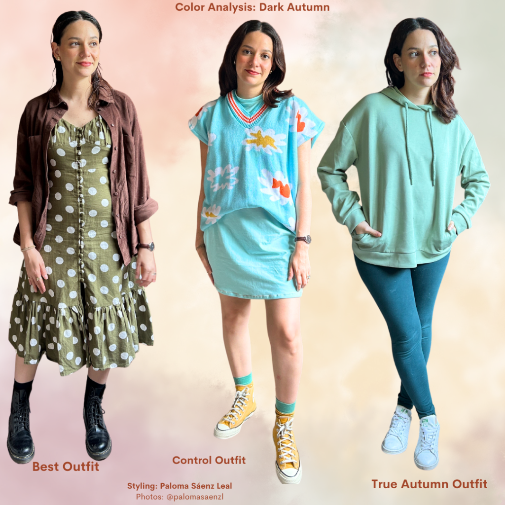
Best Outfit of the Week:
My favorite outfit was the olive green polka dot dress. I borrowed it from my sister and, previously, I thought that wasn’t the green that favored me the most. Personally, I’m drawn to more jewel-toned greens.
But I think I looked really good in that dress, and it didn’t drain me like I thought it would.
The contrast with the brown shirt shows that colors within one palette work together to create a cohesive look, no matter which ones you choose. This makes getting dressed really easy!
True Autumn:
My True Autumn outfit (green sweatshirt and leggings) was for a chill day in. The sweatshirt is in a very muted pistachio green, slightly lighter than the greens in the Dark Autumn palette.
The leggings are forest green which complements the sweatshirt and creates the contrast that I craved without leaving the True Autumn palette.
I think it was a fine look, but I usually pair that sweatshirt with darker or brighter colors and makeup because I think it makes me look paler. And that’s how I felt throughout the day: too pale and drained of color.
Control Outfit:
My control outfit was a bright cyan look. I believe that specific shade of blue is from a Bright Spring color palette. The outfit had orange and yellow accents.
I’ve never thought that cyan was one of my best colors, but this outfit made me so happy. I loved the contrasting colors and the brightness.
But, in the context of color analysis, it is not a color that looks great on me.
Color Analysis – Dark Autumn, Week #8
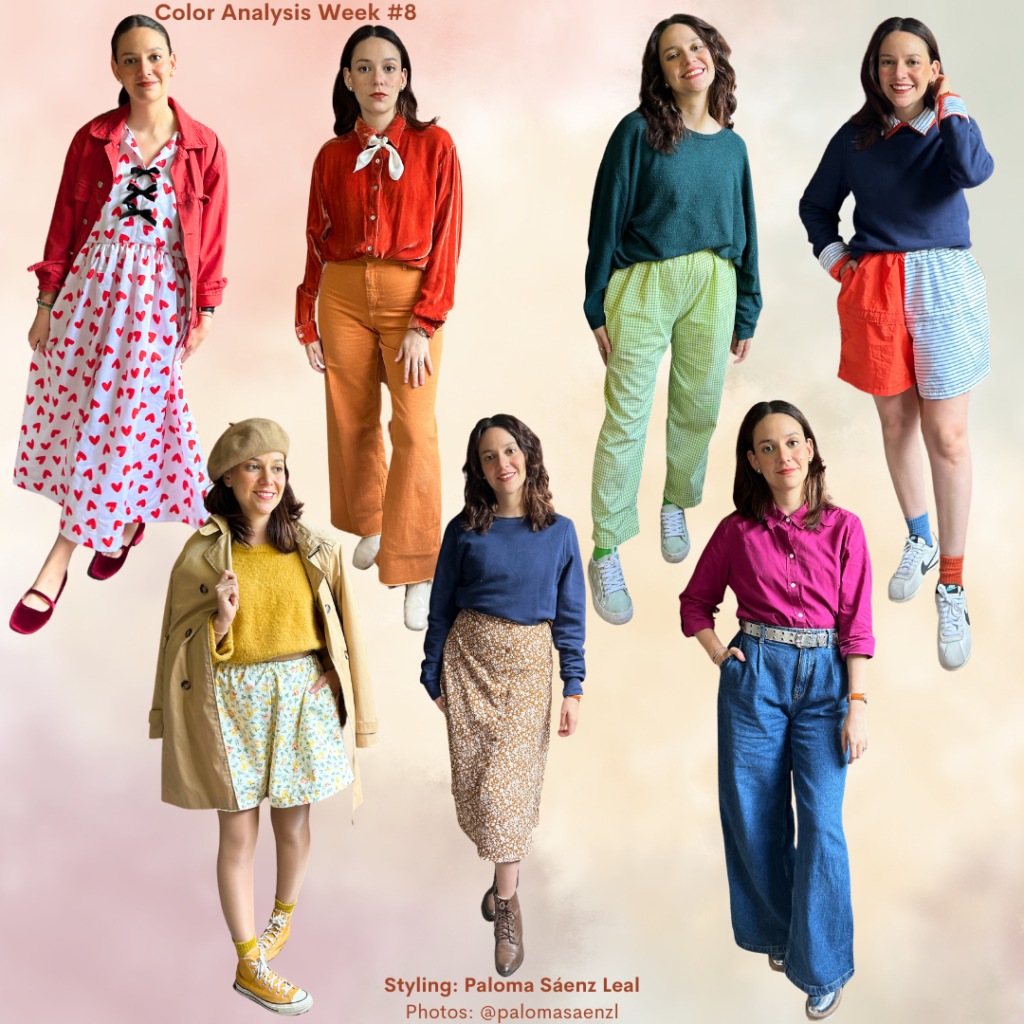
I reached the final week of this experiment and made a ton of progress! During this week, I finally managed to marry my colorful, eclectic style with the Dark Autumn color palette.
As you can see in the pictures, I was more at ease and happier than I was during the rest of the weeks.
This was the week where I felt the most myself, and I truly saw the wonders color analysis can bring. This week had a variation of colors that didn’t include brown (finally!) and textures that really brought my palette forward.
Best Outfit of the Week:
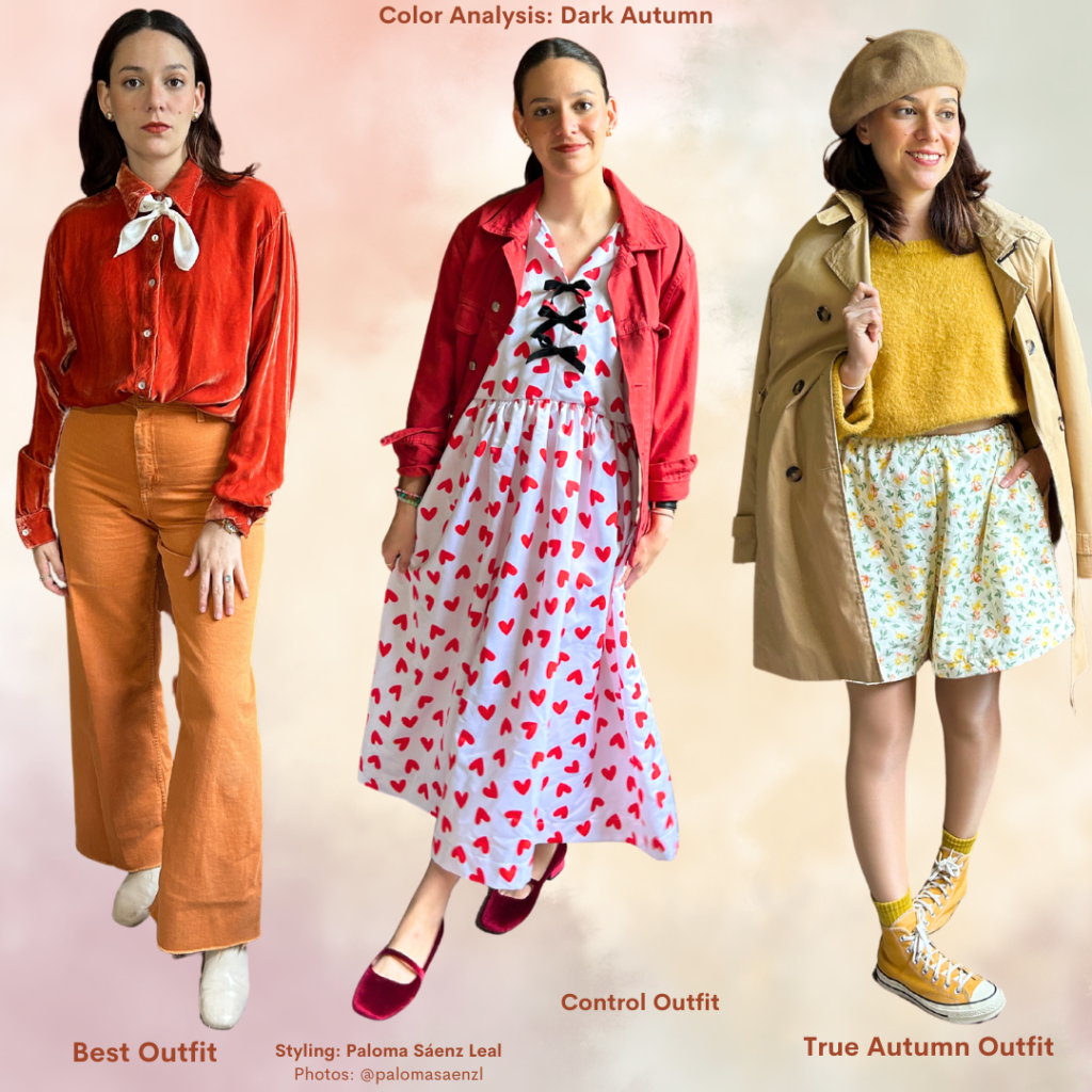
The best outfit was definitely the monochromatic orange look from Monday.
I wore a velvet orange shirt with orange wide-leg jeans. I complemented the look with off-white booties and an off-white neck scarf. With this one, I truly felt the Dark Autumn color palette worked with me.
True Autumn:
The True Autumn look this week was yellow and orange. The yellows in the Dark Autumn and True Autumn palettes are very similar, so I wore a mustard yellow sweater with a pair of floral shorts.
Instead of going with a darker tan or brown, I layered with a light beige trench coat. Finally, I accessorized with a beige beret and a pair of yellow Converse.
I think this is a True Autumn color combo I can use. It has some contrast so I don’t feel drained of color. And while this isn’t my perfect outfit, it does work and I’d wear it again.
Control Outfit
The control outfit this week is truly the crown jewel of outfits. I wore a True Winter palette of crisp white and bright red. The heart-pattern dress was a dream come true, and it was the most beautiful I’ve felt in a while.
Color-palette-wise, I think I can get away with this look, but I do think now that warmer-toned whites work better on me. The red jacket helped the rest of the look work for me; without it, I wouldn’t have looked as good in this.
So… is color analysis worth it?
These past eight weeks were a roller-coaster of emotions and failed outfits.
My best friend, who did know about the experiment, was the person who saw the nuances of the colors better than anyone. She is a makeup artist and has a trained eye, so to her, it was a very visible change.
We both agreed that color analysis makes a huge difference, especially for makeup and hair, because they’re so close to your features. When it comes to clothes, it’s easier to stray from your color palette and get away with it.
My sister, boyfriend, and mom, who also knew about the experiment, saw a slight but noticeable difference. They all agreed that I did look great and the colors suited me, but it was clear that I missed the brighter colors I usually wear.
Other people close to me, who weren’t aware of the experiment, complimented me more when I wore the Dark Autumn palette and complemented certain items or outfits when I was wearing a different palette.
The trickiest part of dressing within your season is that color palettes are, well, seasonal. This means that certain color palettes are easier to find and buy during certain times of the year.
For me, it was hard to dress for warmer weather with my color palette because the things I already had or found in stores were meant for Autumn and Winter. The same happens in reverse; I’ve seen a lot of people categorized as Springs that have a hard time finding clothes during the colder seasons.
But what’s the verdict?
I think there’s merit to color analysis, but it’s not a perfect science, and it’s not a one-size-fits-all answer.
If you’re interested in fashion or makeup, I do think that a lot of what color analysis tells you, you might already know by instinct. Before this, I knew very light and bright colors, like pastels, suited me the least. I knew that high-contrast and saturated colors worked perfectly for me. So the analysis just confirmed these facts.
One very important thing to mention is that color analysis helped me reduce the amount of things I buy because it forced me to think twice before buying.
This was not only true because of the rules but also because it made me think of the color story in my own closet. When I saw something I loved, instead of immediately buying it, I thought of how that particular item would work with the rest of my closet, what I could wear it with, and how much the color worked for me.
Based on what I saw and my feedback, a Dark Autumn palette works best with my features. I can get away with the brighter colors of a Winter palette (thankfully!) because I sit in a neutral sub-season neighbor to the Winter season. I am definitely not a True Autumn; I think it’s too light and muted for me.
Personally, I’ll apply the color analysis for my makeup and hair from now on.
For my clothes, I know what fits me better now, yes, but I also know what truly makes me happy. And if it aligns with my color palette sometimes, that’s great. But, if it doesn’t, I don’t see enough gain to stop wearing what makes me feel like me.
The last week was my favorite; it was the most colorful week of all, and I think it’s obvious how happy that made me.
If you have issues pinpointing what colors suit you and feel like what you’re wearing doesn’t work, color analysis might help you a lot. It might also help you create a capsule wardrobe or reduce unnecessary shopping. If these things apply to you, give color analysis a shot!
If you have more questions about this or want to know which services I hired, comment below, and I will gladly answer all your questions!
What do you think of my color analysis experience?
What do you think? Do you see a difference? Do you know your color season? How was your experience with color analysis? Would you do a color analysis and why?
Let us know in the comments below!
Where/how did you get your colour analysis done? I’d like to get one!
Hi, Grace! I had mine done online, through two services. One (the most accurate one in my eyes) is called Curate Your Style. I linked a couple of their Instagram posts here, but you can find them as @curateyourstyle.
Hope this helps! Let me know how that works for you 🙂